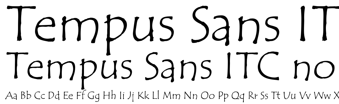
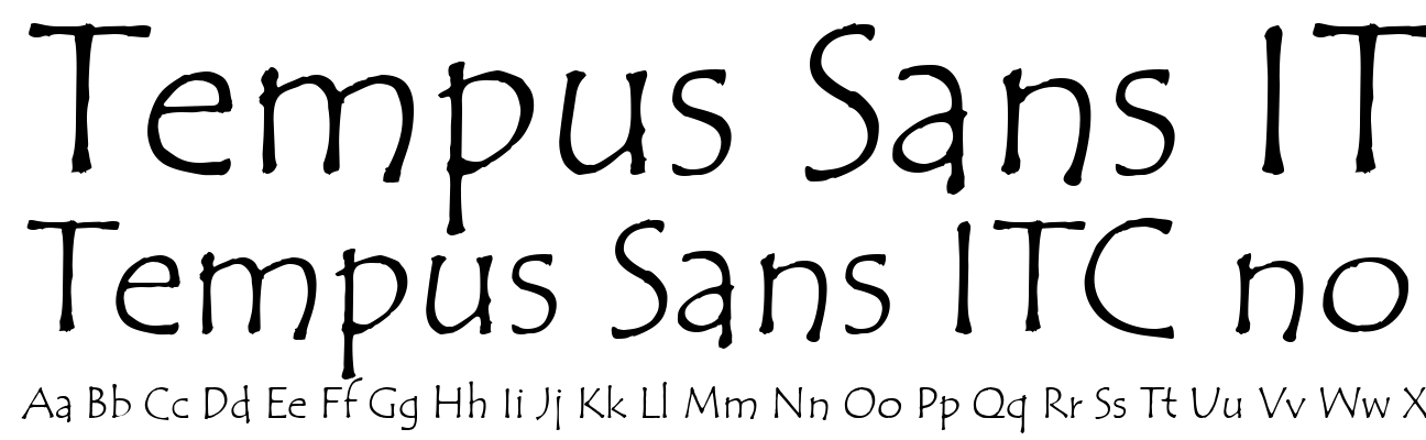
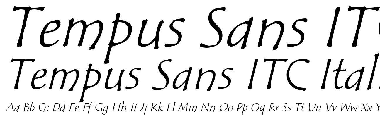
Tempus Sans ITC
- Сімейство шрифтів Tempus Sans ITC
- Повна назва Tempus Sans ITC
- Назва шрифта TempusSansITC_1
- Версія 1.05
- Розширення ttf
- MD5 6e528eaf77e28ebcc849f9769839a5fb
- MIME Type font/sfnt
- Розмір 74.32 КБ
- Кирилиця Ні

| File Type Extension | ttf |
| MIME Type | application/x-font-ttf |
| Copyright | Copyright (c) International Typeface Corporation 1996. Portions Copyright (c) Microsoft Corporation 1996. All rights reserved. |
| Font Family | Tempus Sans ITC |
| Font Subfamily | Regular |
| Font Subfamily ID | Tempus Sans ITC |
| Font Name | Tempus Sans ITC |
| Name Table Version | Version 1.05 |
| PostScript Font Name | TempusSansITC |
| Trademark | ITC Tempus Sans is a Trademark of International Typeface Corporation. |
| Font Subfamily (ca) | Normal |
| Font Subfamily (cs) | obyčejné |
| Font Subfamily (da) | normal |
| Font Subfamily (de-DE) | Standard |
| Font Subfamily (el) | Κανονικά |
| Copyright (en-US) | Copyright (c) International Typeface Corporation 1996. Portions Copyright (c) Microsoft Corporation 1996. All rights reserved. |
| Font Family (en-US) | Tempus Sans ITC |
| Font Subfamily (en-US) | Regular |
| Font Subfamily ID (en-US) | Tempus Sans ITC |
| Font Name (en-US) | Tempus Sans ITC |
| Name Table Version (en-US) | Version 1.05 |
| Post Script Font Name (en-US) | TempusSansITC |
| Trademark (en-US) | ITC Tempus Sans is a Trademark of International Typeface Corporation. |
| Manufacturer (en-US) | International Typeface Corporation |
| Designer (en-US) | Phill Grimshaw |
| Description (en-US) | Phill Grimshaw developed an interest in type design while studying for his master's degree in design at the Royal College of Art in London between 1972 and 1975. Grimshaw claims that every calligrapher's aspiration is to render Roman capitals perfectly with a pen, but admits that it is very difficult to do. For ITC Tempus™ he used a fountain pen on cheap, porous paper, and as you would expect, the ink bled. The resulting letterforms are classically based, but have rugged edges, so they deviate from the 'preciousness' of hand lettered romans. Released in 1996, ITC Tempus is a parody of a classical roman design. It is dictated by proportions, particularly those of capitals. The lowercase is somewhat loose and uninhibited. "Tempus Sans is just Tempus with the serifs surgically removed," Grimshaw says. "Yet the proportions of the characters work nicely." Because of its toughness, the typeface works best at larger point sizes, yet maintains its characters when set at small sizes. You might consider it a "punk roman" that works where a roman face is desired, but the fine edge is not. |
| Vendor URL (en-US) | http://www.itcfonts.com |
| Designer URL (en-US) | http://www.itcfonts.com |
| License (en-US) | Please contact the vendor to learn more about license restrictions. |
| License Info URL (en-US) | http://www.itcfonts.com |
| Font Subfamily (fi) | Normaali |
| Font Subfamily (fr-FR) | Normal |
| Font Subfamily (hu) | Normál |
| Font Subfamily (it-IT) | Normale |
| Font Subfamily (nl-NL) | Standaard |
| Font Subfamily (no-NO) | Normal |
| Font Subfamily (pl) | Normalny |
| Font Subfamily (pt-BR) | Normal |
| Font Subfamily (ru) | Обычный |
| Font Subfamily (sk) | Normálne |
| Font Subfamily (sv-SE) | Normal |
| Font Subfamily (tr) | Normal |
| Font Subfamily (sl) | Navadno |
| Font Subfamily (eu) | Arrunta |
| Font Subfamily (es-MX) | Normal |
| Font Subfamily (pt-PT) | Normal |
| Font Subfamily (es-ES) | Normal |
| Font Subfamily (fr-CA) | Normal |